
40% of all online traffic is found on mobile and tablet
In Australia, traffic originating from mobile devices is rising exponentially each day. 40% of all online traffic is found on mobile and tablet devices, making it more important than ever to ensure your business is visible across these devices.
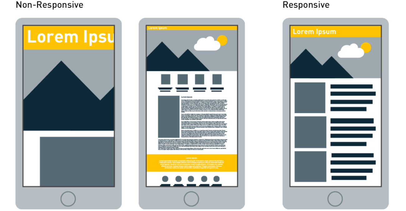
The growth of this usage is also across varying devices’ screen sizes and resolutions, making it tougher to provide a great user experience. A great solution to combat this is Responsive Web Design – providing a consistent website look and feel regardless of where it’s being accessed from.

What is responsive design?
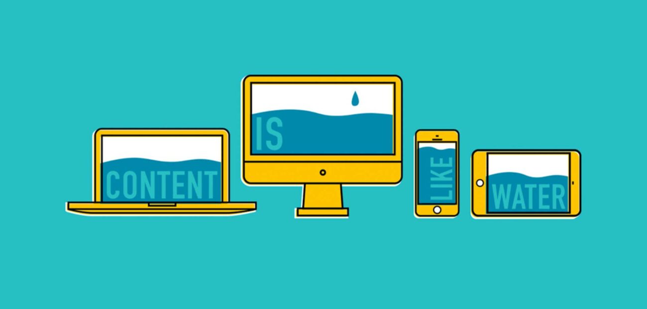
Responsive Web Design is aimed at crafting sites to provide optimal viewing and interaction across a wide range of devices, from 4K desktop computer monitors all the way down to mobile phones.
As a web designer working with responsive sites, it is my job to ensure ease of use through browsing and navigating the website. I do this by examining navigation elements, screen layouts, text, images, audio/video players and other UI elements as they re-adjust themselves on a variety of devices.

Responsive design is no longer a luxury or ‘nice to have’, it is a necessity for keeping your business relevant.
Here are three reasons why.
1. Google SEO is impacted by your site’s responsiveness
As of April, Google’s search engine algorithm has started boosting the ranking of mobile friendly websites. Websites providing a better user experience across multiple devices including mobile phones and tablets will see their Google ranking improve.
Google wants to provide its users with not only the most relevant results, but also the best user experience. If your website isn’t mobile friendly, the likelihood is that a competitor with a superior, responsive website will be found and you will get left behind.
You can check if your site meets the requirements of Google’s Mobile-Friendly Test or check the status of your entire site through the Mobile Usability report in Webmaster Tools.
2. Improved user experience shows that you care
As businesses and technology grow more complicated, it’s easy to forget the most important thing: people. Our partners for managed IT services work furiously with our team when it comes to IT, infrastructure, cyber security and more to ensure all our technologies and implementations for clients are safe and secure.
There’s nothing more frustrating than browsing a website that doesn’t work properly on your phone! Whenever a mobile user is frustrated because they don’t see the content on your site clearly or the loading time is too long or the content is unclear, there’s a 61% chance they will leave and head to another website.
On the flip side, whenever a user has had a positive experience with your website, that individual will be 67% more likely to buy a product or use a service.
A person visits your website because they’re interested, and of course, you want to do business with them. By designing user-centric interactivity, and customising your approach to fit the user’s personal needs, you’re taking steps in the right direction.
Responsive design offers the best way to interact. Whether they are at home, at work, or on the move, it’s easy for them to pick up where they left off.
As technology evolves, so does the expectations of your potential customers. Your business is perceived as trustworthy, up-to-date and worthwhile based largely on how easy it is to connect with you. 48% of users told Google that when a site doesn’t function on their mobile device it makes them feel that the company does not care for their business.
And as innovation grows at the speed of light, new devices with new displays appear faster than web architects are able to adapt. The only fix for this is responsive design.
3. Increase conversions
After adapting user experience responsive design, your users will be able to access information consistently across their devices. Nurturing the sale becomes seamless. Your well-designed user experience will keep them on the site for longer, decreasing bounce rates and increasing conversion rates (SEO Social). The responsive design integration also gives developers control on how the conversion elements will display on mobile and tablet.
Behavioral Psychology models show us that three key factors are at work when users access your site:
- Motivation. What does the user want to do.
- Ease of use. Once a user has the necessary motivation, they need to be able to perform their intended behaviour.
- Triggers. There should be multiple, clear opportunities for users to get to what they need.
In other words, design your site with the aim of making it easy for the user to do what you want them to do.
If you’re using social media as a means to drive traffic and conversion, your website should be responsive since 55% of social media consumption is on mobile devices. Otherwise, it would lead frustrated users to leave. High bounce rates = low conversion rates.
Now is the time to change, before it’s too late. Responsive websites are now crucial building blocks for businesses to stay relevant. Through our partner brand, we offer SMEs website design packages that helps businesses get started online.
A consistent user experience on your website is crucial. It keeps your business visible, whether it’s on a large screen at home, or a tiny screen worn on someone’s wrist. It also acknowledges the new devices and screen sizes to appear in the future market.
By incorporating responsive design into your strategy, you’ve got have all your bases covered and you’re ensuring your business is ready to grow.


